Identifying causal links in NLP-enriched news data (with R code and dataset)

TL;DR - In this article, we briefly introduce you to time series analysis, which we then use to identify causal relationships between different events concerning companies as reflected in the news. For instance we will try to identify what events are likely to occur after a company publishes its quarterly earnings. You can view the accompanying R code on GitHub. You can download the dataset used in this article from Kaggle.
Outline of this article:
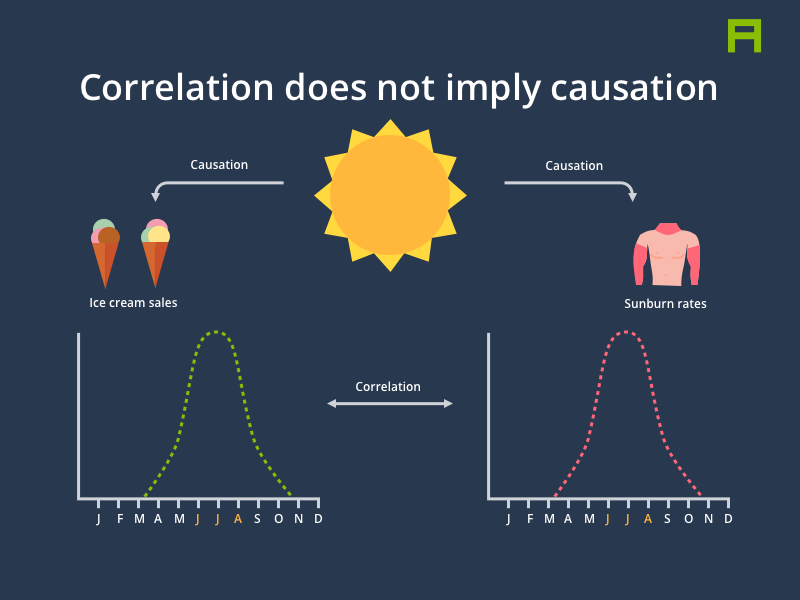
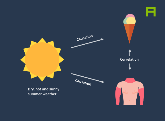
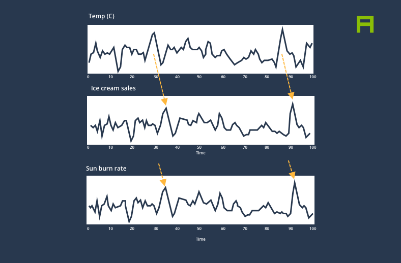
We’ve all heard the phrase “correlation does not imply causation” and intuitively it makes sense: Indeed, the rate of sunburn soaring in the summer months has nothing to do with the increase in ice cream sales. Instead, both phenomena are caused by a common underlying factor, which in this case is an increase in temperature and UV radiation, which itself is caused by the shortened distance between the Earth and the Sun during summer [1].
However, this doesn’t mean that we can’t model causality (beyond a strong correlation) and more importantly, leverage statistical methods and data analysis to build models that help us better understand the causal relationships between various phenomena.
Causal models, often simply visualised as graphs, can be a powerful tool and mental model for expressing and communicating causal links among variables within a system. For instance, it is much more helpful to describe the rise in ice cream sales and in the rate of sunburn as independent “effects” with a common cause which is a shortened distance between the Earth and the Sun, resulting in an increase in temperature and UV radiation.
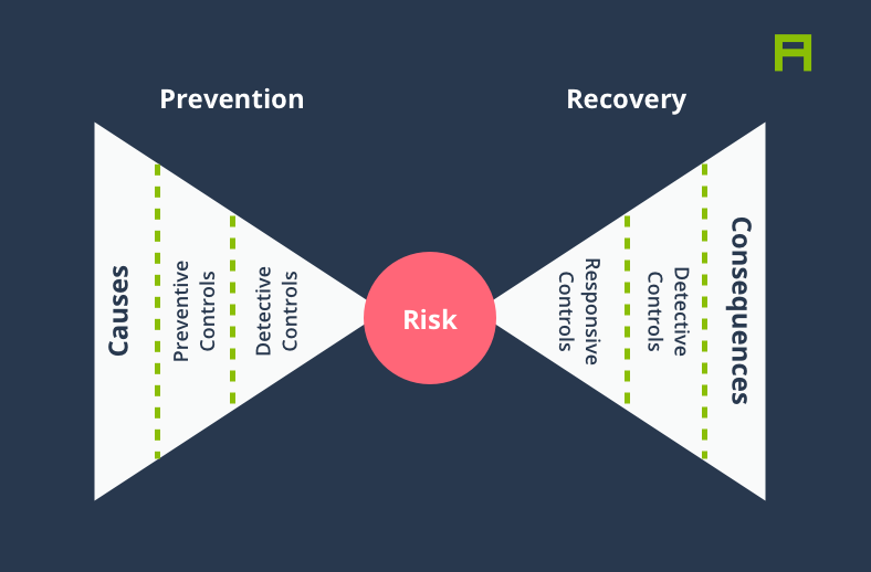
The “Risk Bow-Tie” is a practical example of causal thinking commonly used in Risk Management. The Risk Bow-Tie or the Bow-Tie Method is used for managing risks in a wide range of sectors from military to manufacturing and banking. At the most basic level, a Risk Bow-Tie visualises the causes leading to an event, and the consequences of that event, as well as damage mitigation and preventive measures.
Suppose you are a car manufacturer and you’ve identified a global shortage of semiconductor chips as a risk to your ability to build and ship new cars, hopefully long before it actually happens. A Risk Bow-Tie in this case not only allows you to come up with preventative measures to mitigate risks, but causal thinking can also help you identify and better prepare for any consequences arising from this risk should it ever materialise.
In this article we aim to demonstrate how time series analysis could be utilised to help us identify causal links among a large pool of events extracted from the world’s news. For instance, if we knew that every time a public US company is reported to suffer a data breach, it issues an announcement within a few days, and furthermore the company has a high likelihood of being investigated by the FTC within a few weeks, we could use that knowledge to make better decisions regarding what might happen next every time a new data breach event happens. This exercise can be immensely valuable in risk management processes for scenario analysis, as well as forecasting applications.
Before we demonstrate how this could be done, let us briefly introduce a few concepts that will help you understand what’s going on when we look at the actual analysis later on.
The relationship between a cause (increase in temperature) and an effect or a series of effects (increase in ice cream sales) takes place in a sequential order over time, so unless you believe that the arrow of time could be reversed (like it does in Christopher Nolan’s Tenet), you could expect the effect to always take place some time–a number of seconds, minutes, days, weeks or months–after the cause.
This means that the problem we’re trying to solve–identifying what kind of event causes another kind of event–lends itself nicely to time series analysis. (Although we should highlight that just because something happened after another thing, it doesn’t mean that it was caused by it. This is a logical fallacy called post hoc ergo propter hoc)
A time series is simply a sequence of observations made over time. Let’s say you measure your weight every day and record the data in a spreadsheet. By doing so you are creating a time series tracking your weight. Similarly, the temperature in your city in each month of the year forms a time series data, and so does the number of articles written each day about Apple or Google. You get the idea.
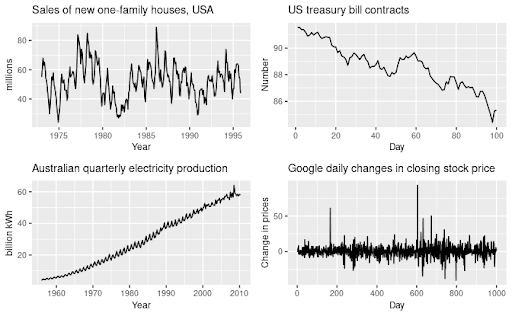
Fig 1. Examples of various time series. Source: https://otexts.com/fpp3/tspatterns.html
Now let us take a brief look at time series forecasting, or in other words, how to predict the future values of a time series given its past values, and any other useful information we may have about the timeseries. Let’s imagine you continued to weigh yourself every day for a year, and now you would like to predict what your future weight might be in, let’s say, 3 months' time. In this case a good forecast may take into consideration the seasonal fluctuations in your weight, and account for a bump after Thanksgiving, Christmas or wedding season.
As you can imagine, forecasting a time series is a non-trivial task and it’s borderline impossible in some cases, for example when the forecast might impact the thing we’re trying to forecast (e.g. predicting the stock market). That being said, luckily a lot of smart folks have been thinking about this problem for decades and perhaps centuries, and we have a wealth of knowledge today on how to go about forecasting time series data where possible.[2]
Some of the commonly used techniques for time series forecasting are listed below:
We won’t go into the specifics of each forecasting model in this article, but let us briefly explain how ARIMA models work to help you better understand how it can be used for inferring causal relationships. If you’re interested in learning more about time series forecasting, we highly recommend reading Forecasting: Principles and Practice by Rob J Hyndman and George Athanasopoulos.
ARIMA
ARIMA family of models are the workhorse of time series forecasting. They are so simple and yet so effective that you would find them in nearly every forecasting handbook and toolbox.
Let’s break down ARIMA: ARIMA stands for Autoregressive Integrated Moving Average. Wait, what?
So when you put all of these pieces together, you get a model that aims to predict the future values of a time series given its past values and forecast errors, after the time series has been made stationary.
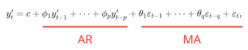
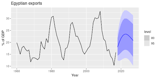
Fig 2. Forecasting Egyptian exports using an autoregressive model
Now that we got the basics out of the way, let’s talk about the fun stuff–causality!
BIG CAVEAT: If you’ve read this far you must be expecting a big reveal. And indeed there is one, but with a big caveat. Causality is a big serious word in the world of statistics, and one can’t simply throw it around. When we talk about causality in this section, we’re referring to a weak and simplified notion of causality called Granger Causality, named after the late British econometrician, Clive Granger. For a deep philosophical view towards causality, refer to Judea Pearl’s work.
Okay, now let’s get to the fun part for real.
Back to our weighing example, let’s imagine that every day you not only measure your weight, but you also measure your intake of calories. Of course your body is a complex system and more calories may not always translate to a jump in your weight. But for simplicity let’s say we’ve eliminated all the other factors, and our hypothesis is that the more calories you take in, the more your weight goes up.
In this scenario, you might notice that the changes to your weight (remember that with differencing we decided to record the changes rather than the absolute values) are strongly dependent on the changes to your calorie intake, let’s say a week or a month prior. So there’s clearly a causal relationship going on here. If you plotted your daily calorie intake and weight change charts, you might get something like this:
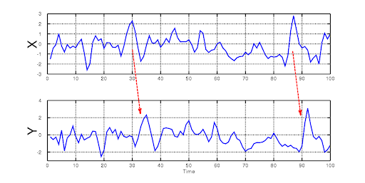
Fig 3. Causal relationship between two time series
Granger causality allows us to statistically and numerically test whether this might be true. In Granger causality, we compare two forecasts obtained for a time series X:
We then compare these two forecasts and if the second one is more accurate than the first one in predicting the future values of our time series, and this is true only in one direction, we may conclude that Y Granger-causes X. In other words, if adding the information about calories helps us predict weight, but adding information about weight doesn't help me predict calories, then calories Granger-cause weight gain.
(Note that the distinction between “causality” and “Granger causality” is so important that we use the “Granger” prefix for the causation verb)
Equipped with the basic knowledge of time series forecasting and Granger causality, we can now look at a practical example.
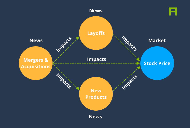
At AYLIEN we collect millions of news articles every day, and we use our NLP models to tag these articles. One type of tag, entities, specifies the companies that are mentioned in the article, for instance Apple. Another type of tag, categories, specifies various events and topics that are discussed in an article, for example “new product releases” (indicated using a code).
Since AYLIEN collects and tags news articles every minute of every day over years and years, our News Intelligence platform could be seen as a giant database of time series data for millions of entities and event types. We’ve recently open sourced a portion of our time series data called SNES - Stock-NewsEventsSentiment which you can download from here.
Let’s have a look at an example. Below we see the volume of English news articles mentioning Apple (the company) over the past 18 months, for various types of events. For instance we can see that the chart for Corporate Earnings spikes very regularly once per quarter. Not only that, we can also see that the volume of positive articles seems to go up a short while after Apple announces a new product (see the “New Products” and “Positive Sentiment” rows in the chart below). This is exactly what we’re interested in looking at.
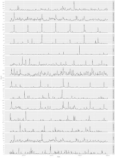
Fig 4. Time series data for number of news articles written about different event types related to Apple
You can probably guess where we’re going with this: By applying a Granger causality test to this data, we can identify causal links among different event types, i.e. what event types might cause what other types of events. We can answer this question by running pairwise Granger tests over time series that each reflect the volume of articles published about a specific event type. Note that as discussed above we must first make our time series data stationary, for instance by using differencing.
Also note that Granger causality is a parametric model, meaning it expects us to provide a lag value i.e. number of time steps between “cause” and “effect”. We can run our tests for various lag values, let’s say 1, 3, 7 and 30 days.
The table below shows a subset of the results obtained using Granger causality applied to the time series data for Apple. Each row represents a single Granger test with a specific order (number of days between “cause” and “effect”) and a pair of event types. The P column represents the P value from the Granger causality test, and indicates how confidently we can reject the null hypothesis [3], or in other words, how likely it is that there is a causal relationship between the two event types.
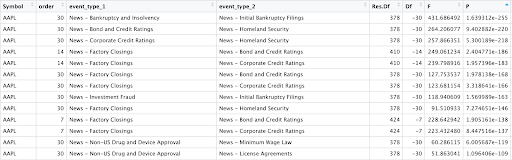
Fig 5. Sample of results from running Granger causality tests over pairwise event time series related to Apple
There are many ways to visualise the above data. For instance we can use a graph or a Sankey diagram demonstrate the causal chain for a given event type:
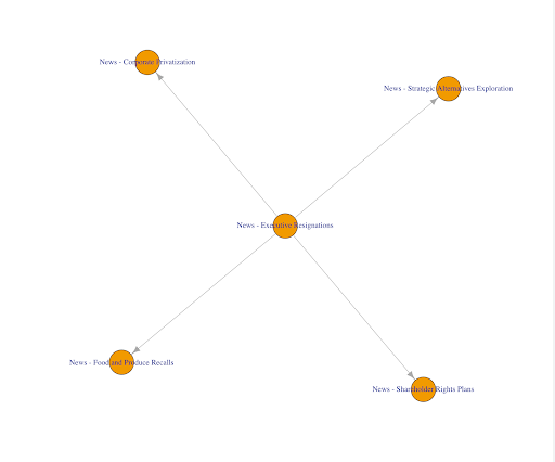
Fig 6. Graph visualisation of inferred causal links for a specific causal order
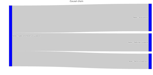
Fig 7. Sankey diagram showing likely future events given a specific event and causal order (e.g. 7 days)
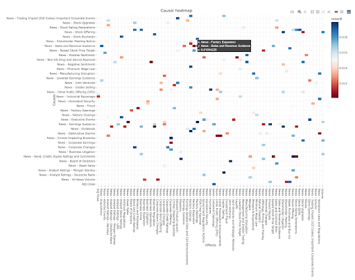
Not every relationship we extract this way is going to reflect an actual causal relationship. Indeed our methodology above is prone to all sorts of errors, for instance misidentifying spurious correlations as causal relationships. Therefore it would be useful to navigate through lots of potential causal relationships and evaluate them to identify genuine relationships. For this purpose we can use an interactive heatmap chart like the one below:
We hope you enjoyed this rather long blog post. If you’ve read this far make sure you give yourself a tap on the shoulder–you deserve it!
You can see the R code for this article here, and the dataset can be downloaded from here.
The world of causal inference in time series data is quite vast and we’ve only scratched the surface here. If you’d like to continue educating yourself in this area, this amazing blog post by Shay Palachy nicely curates and summarises a wide range of techniques for causal inference using time series data and their advantages and disadvantages, which could guide your next steps.
Until next time!


20 Aug, 2024

Keith Doyle
4 Min Read
16 Feb, 2024
Ross Hamer
4 Min Read
24 Oct, 2023
Ross Hamer
5 Min Read
From time to time, we would like to contact you about our products and services via email.