As you may know we recently launched a new service offering, our News API, and over the past week or so we’ve been using it to run some little experiments around analyzing news content. We wanted to use the News API to collect and analyze popular news headlines. We set out to find both similarities and differences in the way two journalists write headlines for their respective news articles and blog posts. The two reporters we selected operate in, and write about, two very different industries/topics and have two very different writing styles:
- Finance: Akin Oyedele of Business Insider, who covers market updates.
- Celebrity: Carly Ledbetter of the Huffington Post, who mainly writes about celebrities.

Note: For a more technical, in-depth and interactive representation of this project, check out the Jupyter notebook we created. This includes sample code and more in depth descriptions of our approach.
The Approach
We set out some clear steps to follow in comparing the writings of our two selected authors:
- Collect news headlines from both of our journalists
- Create parse trees from collected headlines (we explain parse trees below!)
- Extract information from each parse tree that is indicative of the overall headline structure
- Define a simple sequence similarity metric to quantitatively compare any pair of headlines
- Apply the same metric to all headlines collected for each author to find similarity
- Use K-Means and tSNE to produce a visual map of all the headlines so we can clearly see the differences between our two journalists
So what exactly are parse trees?
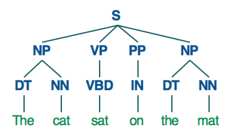
In linguistics, a parse tree is a rooted tree that represents the syntactic structure of a sentence, according to some pre-defined grammar. Here’s an example; For example with a simple sentence like “The cat sat on the mat”, a parse tree might look like this;

Thankfully parsing our extracted headlines isn’t too difficult. We used the Pattern Library for Python to parse the headlines and generate our parse trees.
Data
In total we gathered about 700 article headlines for both journalists using the AYLIEN News API which we then analyzed using Python. If you’d like to give it a go yourself, you can grab the Pickled data files directly from the GitHub repository (link), or by using the data collection notebook we prepared for this project. First we loaded all the headlines for Akin Oyedele, then we created parse trees for all 700 of them, and finally we stored them together with some basic information about the headline in the same Python object. Then using a sequence similarity metric, we compared all of these headlines two by two, to build a similarity matrix.
Visualizations
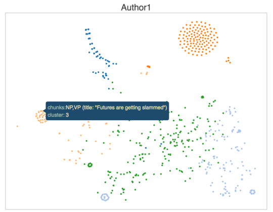
To visualize headline similarities for Akin we generated a 2D scatter plot with the hope of grouping similarly structured headlines close together in a graph in groups of sorts. To achieve this, we first reduced the dimensionality of our similarity matrix using tSNE and applied K-Means clustering to find groups of similar headlines. We also used some a nice viz library which we’ve outlined below;
- tSNE to reduce the dimensionality of our similarity matrix from 700 down to 2
- K-Means to identify 5 clusters of similar headlines and add some color
- Plotted the actual chart using Bokeh

The chart above shows a number of dense groups of headlines, as well as some sparse ones. Each dot on the graph represents a headline, as you can see when you hover over one in the interactive version. Similar titles are as you can see grouped together quite cleanly. Some of the more stand-outish groups are;
- The circular group left of center typically consists of short, snappy stock update headlines such as “Viacom is crashing”
- The large circular group on the top right are mostly announcement-style headlines such as “Here come the…. “ formats.
- The small green circular group towards the bottom left are similar and use the same phrases we see headlines such as “Industrial production falls more than expected” or “ADP private payrolls rise more than expected”.
Comparing the two authors
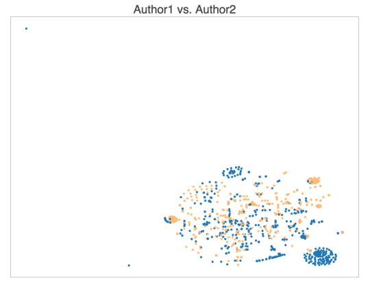
By repeating the process for our second journalist, Carly Ledbetter, we were then able to compare both authors and see how many common patterns exist between the two in terms of how they write their headlines. We observed that roughly 50% (347/700) of the headlines had a similar structure.

Here we can see the same dense and sparse patterns, as well as groups of points that are somewhat unique to each author, or shared by both authors. The yellow dots represent our Celebrity focused author and the blue our finance guy.
- The bottom right cluster is almost exclusive to the first author, as it covers the short financial/stock report headlines such as “Here comes CPI”, but it also covers some of the headlines from the first author such as “There’s Another Leonardo DiCaprio Doppelgänger”. Same could be said about the top middle cluster.
- The top right cluster mostly contains single-verb headlines about celebrities doing things, such as “Kylie Jenner Graces Coachella With Her Peachy Presence” or “Kate Hudson Celebrated Her Birthday With A Few Shirtless Men” but it also includes market report headlines from the first author such as “Oil rig count plunges for 7th straight week”.
Conclusion and future work
In this project we’ve shown how you can retrieve and analyze news headlines, evaluate their structure and similarity, and visualize the results on an interactive map. While we were quite happy with the results and found it quite interesting there were some areas that we thought could be improved. Some of the weaknesses of our approach, and ways to improve them are: - Using entire parse trees instead of just the chunk types - Using a tree or graph similarity metric instead of a sequence similarity one (ideally a linguistic-aware one too) - Better pre-processing to identify and normalize Named Entities, etc.
Next up..
In our next post, we’re going to study the correlations between various headline structures and some external metrics like number of Shares and Likes on Social Media platforms, and see if we can uncover any interesting patterns. We can hazard a guess already that the short, snappy Celebrity style headlines would probably get the most shares and reach on social media, but there’s only one way to find out. If you’d like to access the data used or want to see the sample code we used head over to our Jupyter notebook. 
Related Content
-
 General
20 Aug, 2024
The advantage of monitoring long tail international sources for operational risk

Keith Doyle
4 Min Read
-
 General
16 Feb, 2024
Why AI-powered news data is a crucial component for GRC platforms

Ross Hamer
4 Min Read
-
 General
24 Oct, 2023
Introducing Quantexa News Intelligence

Ross Hamer
5 Min Read
Stay Informed
From time to time, we would like to contact you about our products and services via email.
